TravelMate
A travel companion for finding places and keeping the plan in one spot.
Idea
A travel companion for finding places and keeping the plan in one spot.
System
Quiet serif wordmark. App built around photo-led discovery and itineraries.
Delivered
Logo and mobile app design.
Design notes
The client and the brief
TravelMate is a travel companion for finding places and keeping the plan in one spot. The work was the logo and the design of the mobile app.
From idea to screens
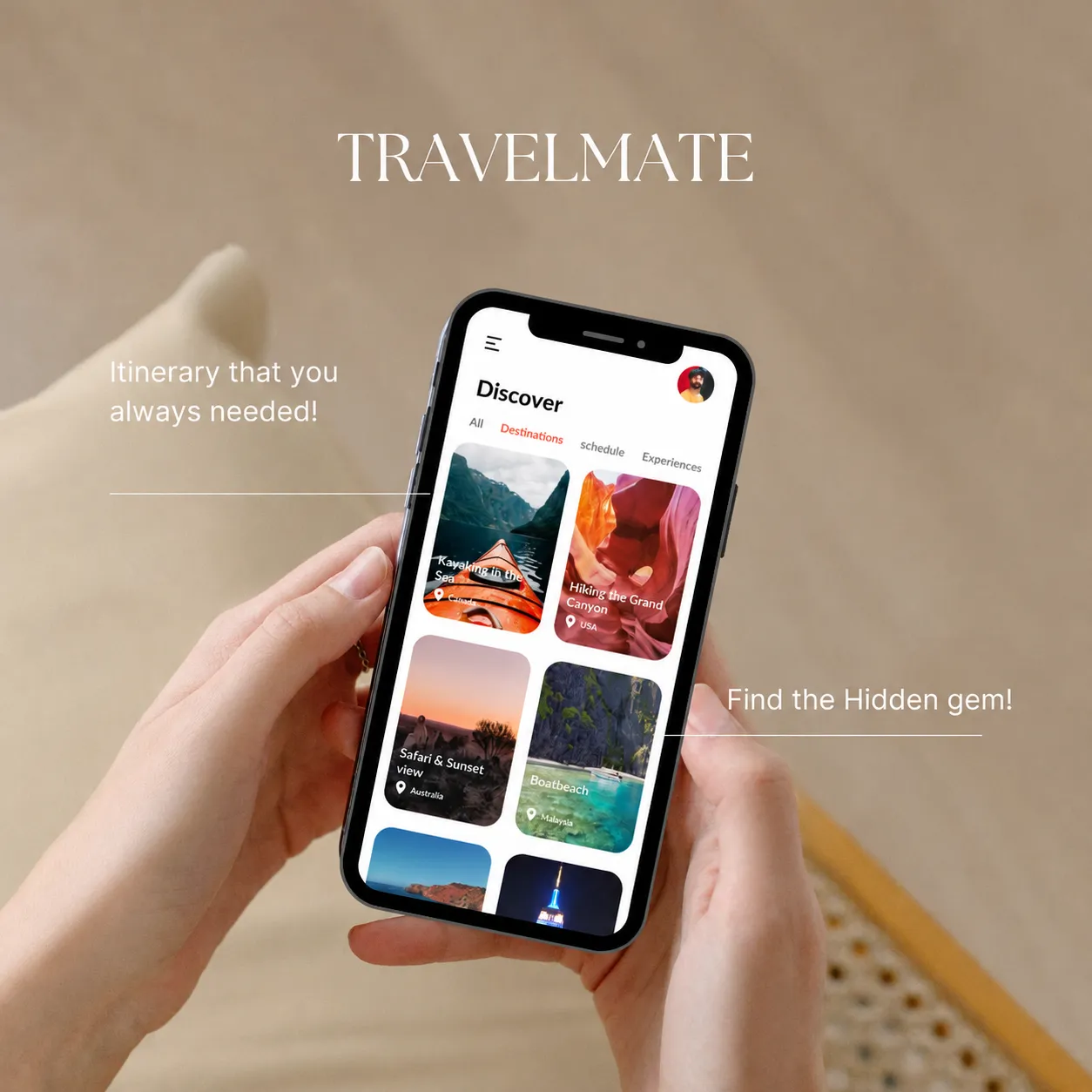
The app starts from a simple split: finding places, and keeping the plan. Finding is handled with photographs, because a place is easier to want when you can see it. Keeping the plan is handled with itineraries, so the trip stays in one spot. The wordmark is kept quiet so it never competes with either.
A quiet wordmark
TRAVELMATE is set in a light serif, in capitals. It stays out of the way of the photographs, which are the main event in this app.
Photo-led discovery
The Discover screen is a grid of photo cards, with the pictures leading and the interface kept light around them. Sand, a pale blue-grey and a near-black give the screens a calm backdrop, so the colour comes from the places themselves.
Plans in one place
The itinerary is the other half of the idea. The plan lives next to the places it is made from, so there is no switching between a notes app and a map. The lines “Itinerary that you always needed” and “Find the hidden gem” on the mock-ups sum up the two halves.
Palette
- #AE9A85
- #D8DEEC
- #23231E

DISCOVER · ITINERARY · HIDDEN GEMS