Dopper Stone Factory
A stone-paper maker whose logo is paper folded into an arrow.
Idea
A stone-paper maker whose logo is paper folded into an arrow.
System
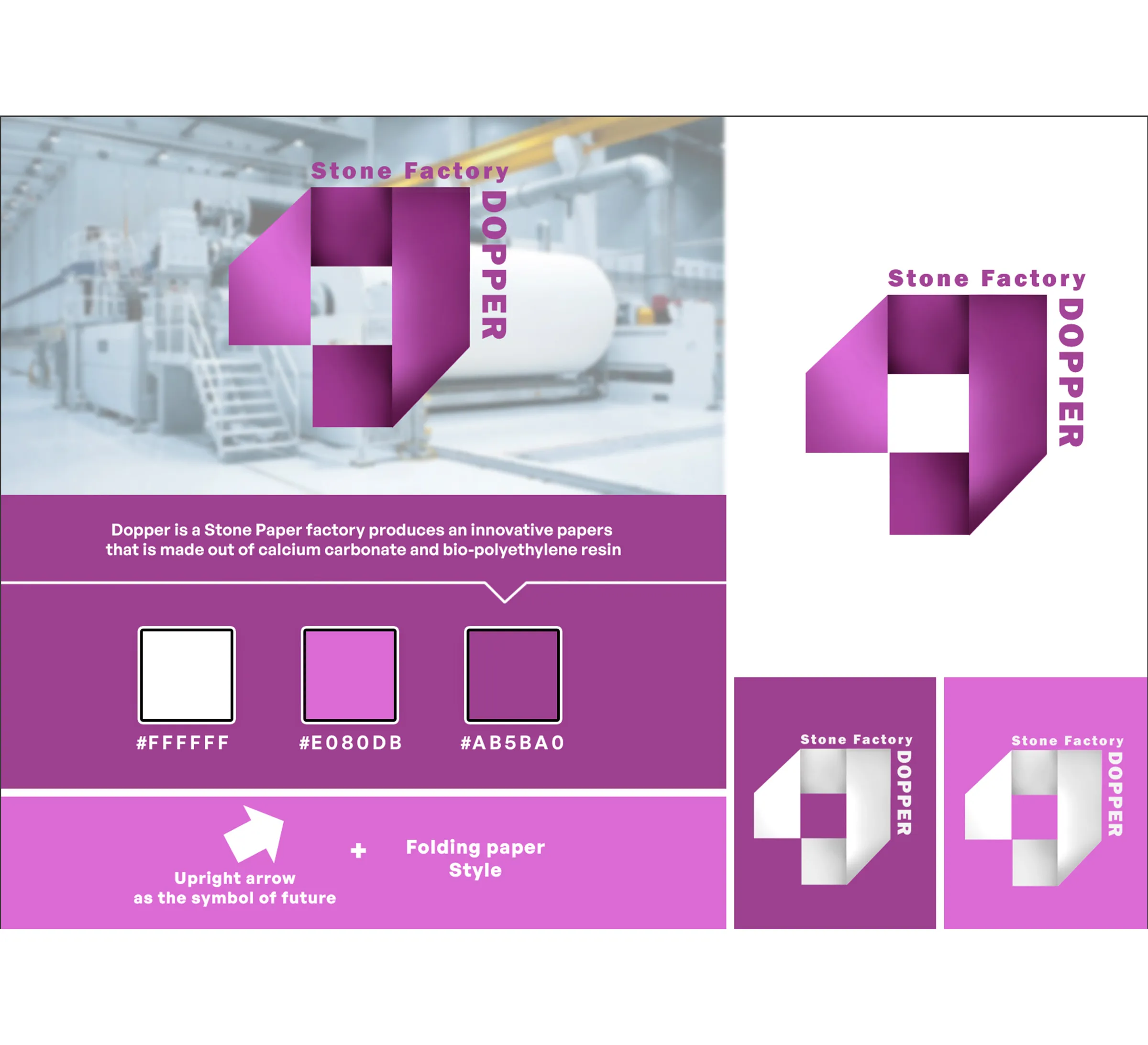
Folded-paper form in orchid and plum, with white reversed versions for colour grounds.
Delivered
Logo, colour palette, reversed variants.
Paper that looks forward.
Dopper makes stone paper from calcium carbonate and bio-polyethylene resin. The mark had to feel new.
The factory
A modern paper maker, so the mark needed to look made, not drawn.
The colour
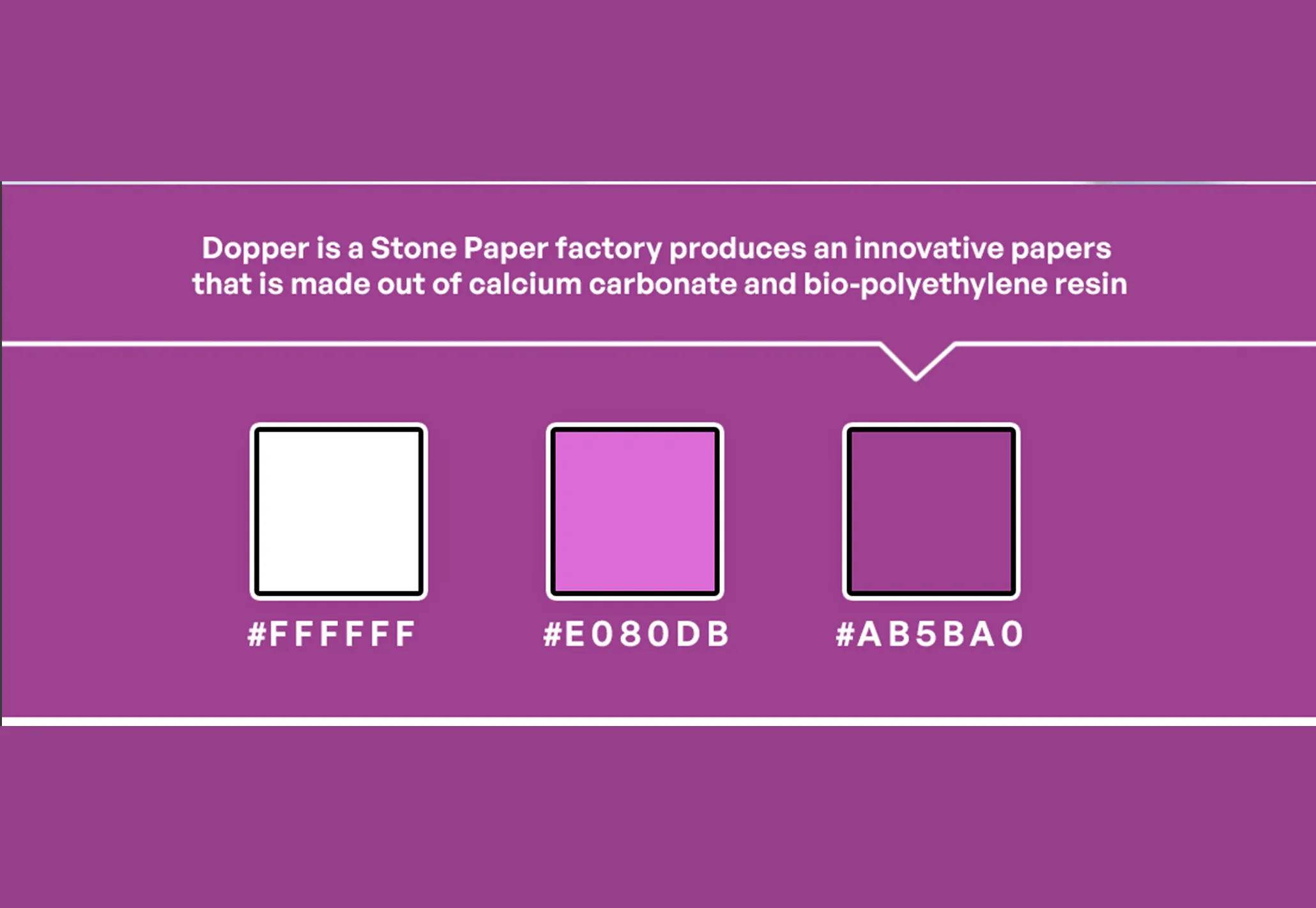
White, orchid and plum: a confident purple range.
The idea
An upright arrow for the future, folded like paper.
Design notes
From idea to mark
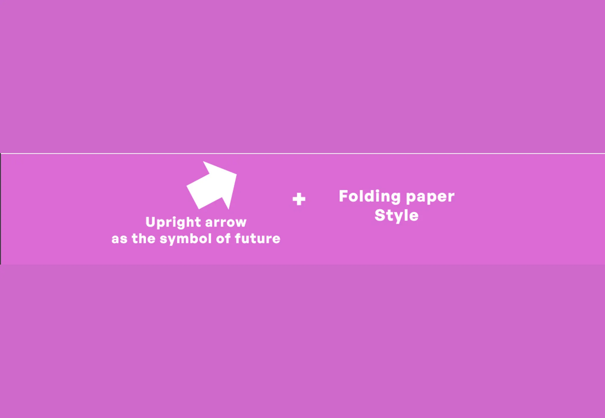
The idea comes from two plain observations: what the factory makes and where it is heading. An upright arrow stands for the future. A folded-paper treatment says paper. The brand board shows them side by side, arrow plus folding, and the final mark is the two combined: an arrow whose planes turn over one another like a sheet that has been creased.
Made, not drawn
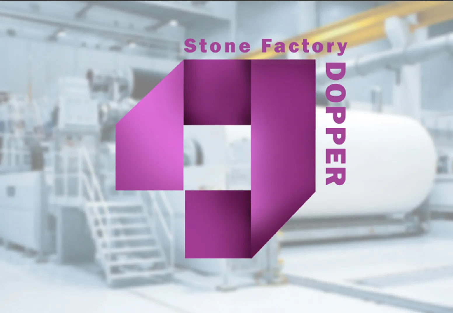
The mark is built from flat planes that fold over one another, with a soft shade on each fold, so it looks cut and creased rather than sketched. Taken as a whole it is an upright arrow, folded the way a sheet of paper would be.
The lock-up
“Stone Factory” runs across the top and DOPPER stands vertically down the right edge, so the wordmark wraps around the mark instead of sitting underneath it. The result is a compact, almost square shape that is easy to place.
Colour and versions
White, orchid and plum make up a confident purple range, and the mark itself shades from orchid to plum. On colour grounds it reverses to white: white on plum and white on orchid.
Palette
- #FFFFFF
- #E080DB
- #AB5BA0