Point
Business consulting that gets to the point. One sharp, memorable mark.
Idea
Business consulting that gets to the point. One sharp, memorable mark.
System
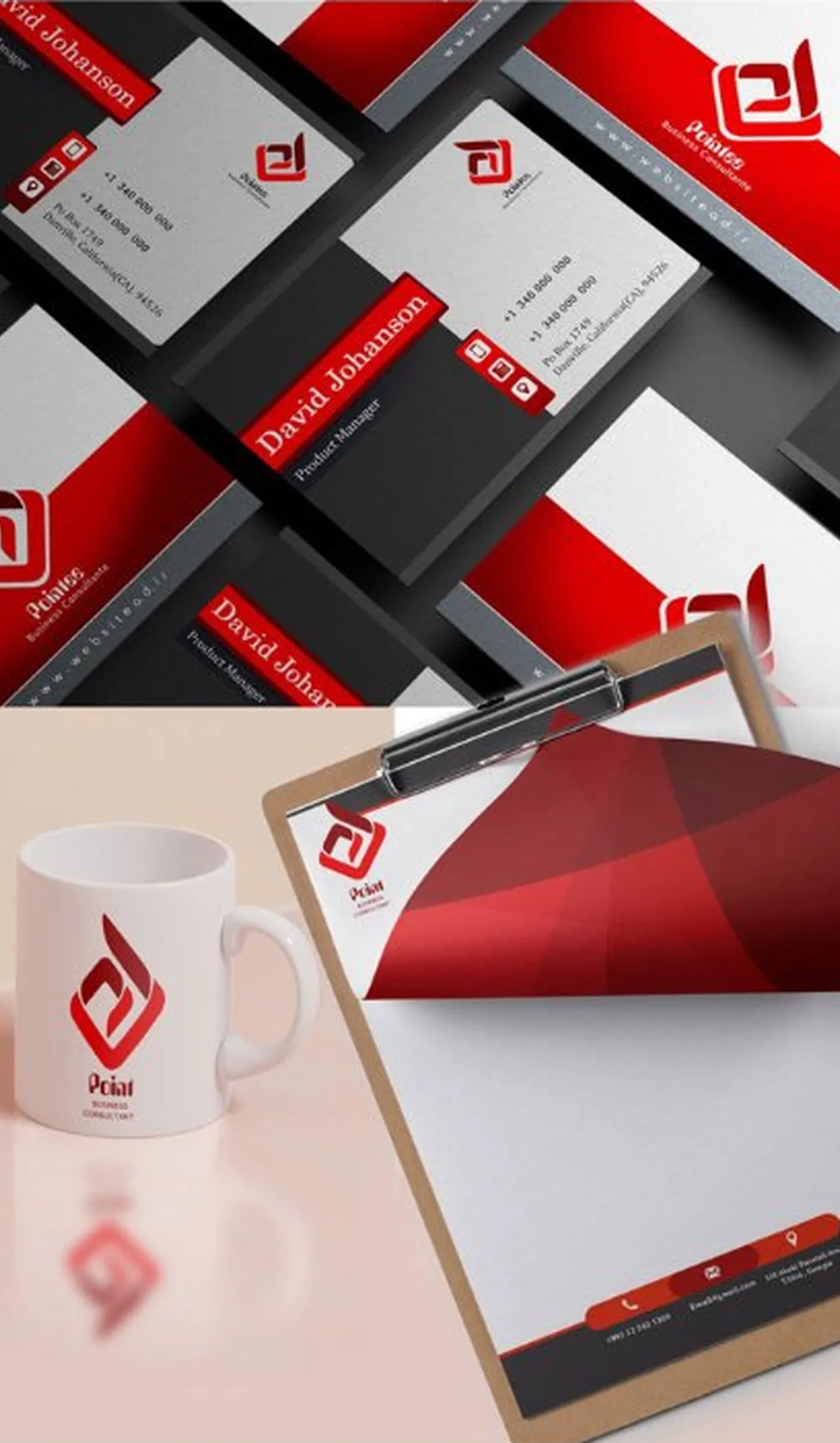
Red and charcoal palette. The mark applied across stationery, cards, mug and presentation.
Delivered
Logo, colour palette, letterhead, business cards, brand presentation.
Design notes
The client and the brief
Point is business consulting that gets to the point. The ask was one sharp, memorable mark and the identity around it: a logo, a colour palette, a letterhead, business cards and a brand presentation.
From gesture to mark
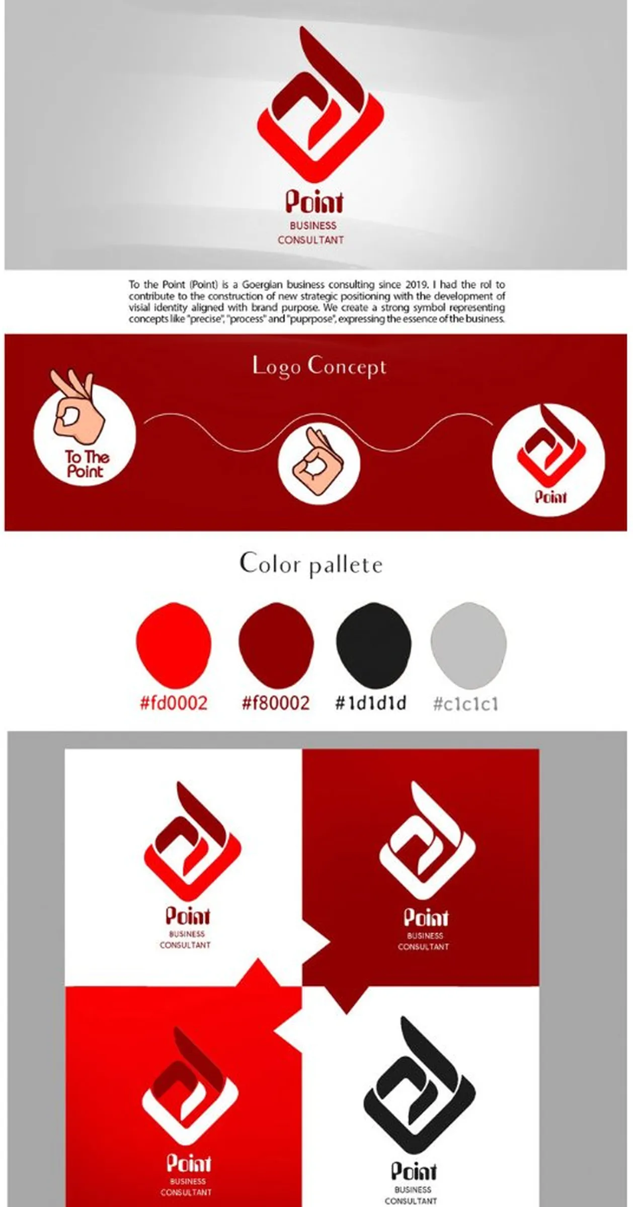
The brand board shows where the symbol came from. It starts with a hand gesture labelled “To The Point”, simplifies it, and arrives at the final mark. The ideas the symbol had to carry are written on the board as well: precise, process, purpose.
The mark
A rounded diamond in bright red frames a darker red form that sweeps up and out of it. It is one shape and one idea, which keeps it clear when it is small, as it will be on a business card.
Colour
Red does the talking, so everything around it stays quiet: a deeper red, charcoal and a light grey. The mark comes in four versions: red and dark red on white, white on dark red, white on bright red, and black on white.
On stationery
The mark sits on black and red business cards, on a letterhead with a red band along the foot, and on a white mug. Black and red are used as solid blocks rather than thin accents, so each piece reads as part of the same set.
Palette
- #FD0002
- #B00002
- #1D1D1D
- #C1C1C1