Sidonian
Faith, place and the sea in a single shield-shaped mark.
Idea
Faith, place and the sea in a single shield-shaped mark.
System
Anchor, S and cross merged into one form. Blue-violet palette with a gradient and flat versions.
Delivered
Logo with light, violet and blue variants.
Three ideas, one mark.
Sidonian is named after Sidon, a historic coastal city in Lebanon. The client asked for an anchor.
The place
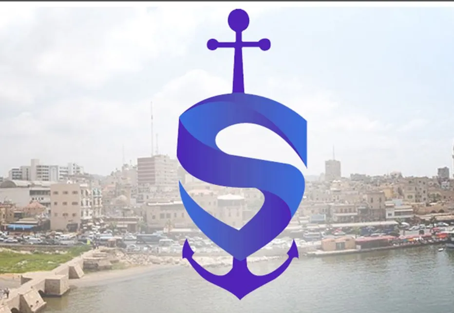
A coastal city with a long Christian history.
The formula
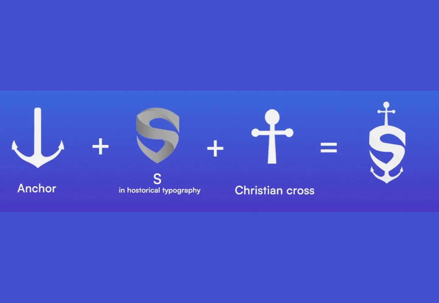
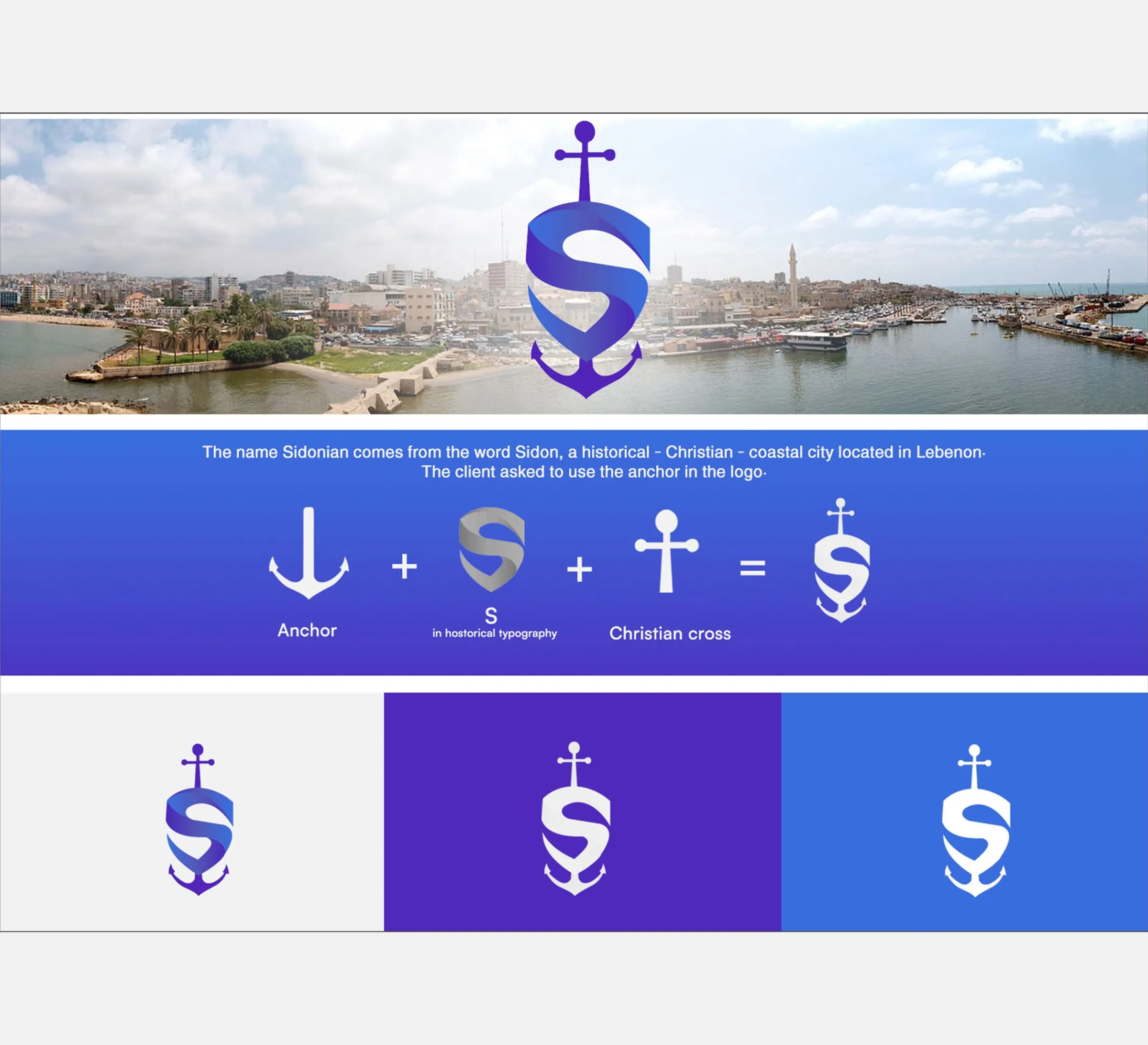
Anchor, a historic S, and the Christian cross become one shield.
The system
Gradient, violet and blue versions for every background.
Design notes
From idea to mark
The brand board lays the thinking out as a formula: an anchor, plus an S in a historical style, plus the Christian cross, equals the shield. The anchor is what the client asked for, the S is the name, and the cross comes from the city’s long Christian history. Each piece is simple on its own, and the work was in making them share one outline so none of them gets lost.
One shield
The mark is a single shield shape. An S drawn in a historical style forms the body, the flukes of the anchor close the bottom and the cross rises from the top. There are three ideas in it, but only one silhouette, so it reads as one mark rather than a collection of symbols.
Colour and versions
The full-colour mark carries a blue-to-violet gradient. For flat colour grounds it turns white, on violet and on blue, and there is a version for light backgrounds too. The palette is deliberately short: a violet, a blue and a light grey.
Place
The brand board sets the mark over a harbour photograph of a coastal city, tying the shield to the place the name comes from.
Palette
- #4F29BC
- #396DDD
- #F2F2F2