Julia Simpson
A lotus for a coach who guides people out of hard places: financial, life and health.
Idea
A lotus for a coach who guides people out of hard places: financial, life and health.
System
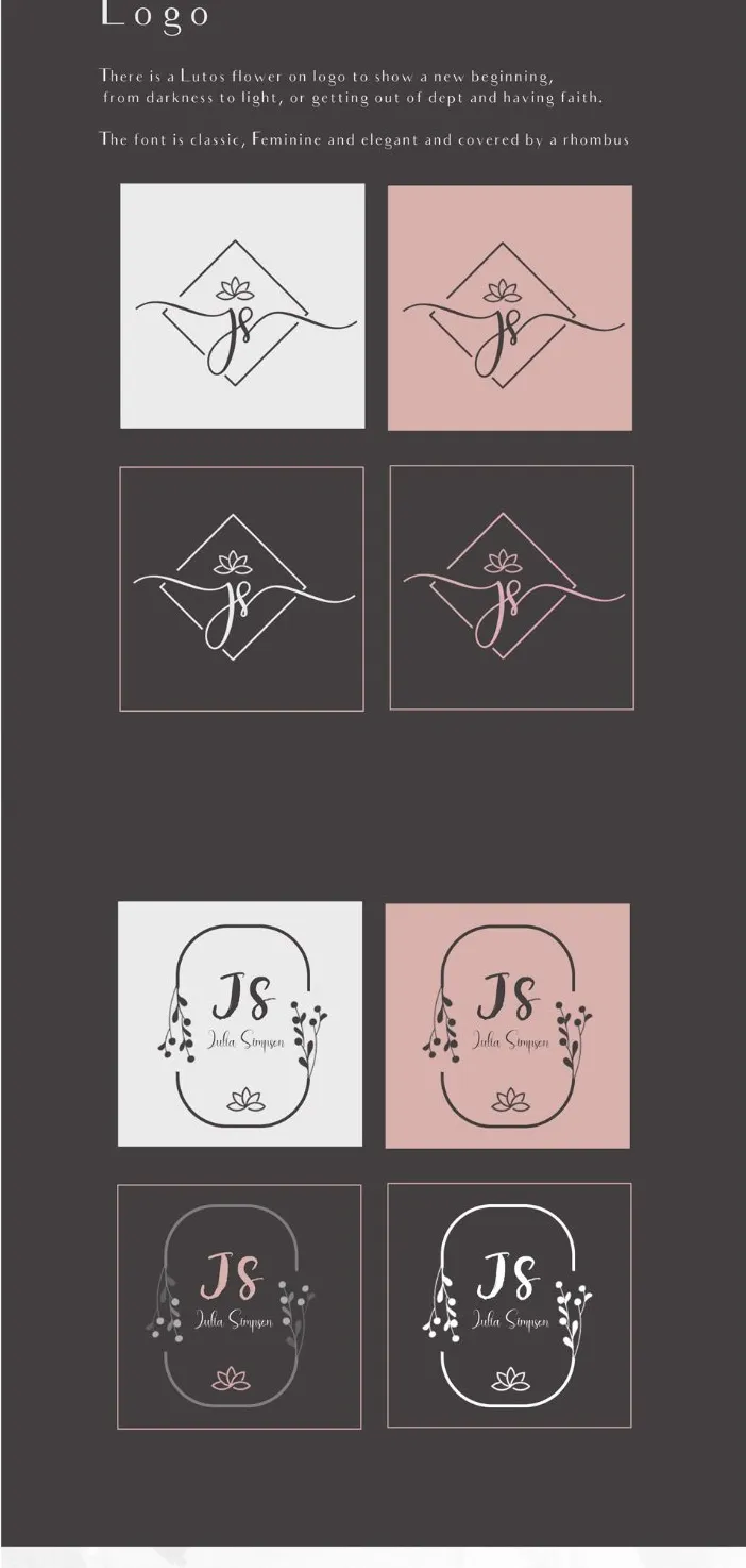
Lotus in a rhombus with a script JS monogram. A second round-frame mark with botanical sprigs.
Delivered
Logo suite, colour palette, typography, brand board.
Why a lotus.
A lotus grows in deep mud and still reaches the light. That is the story Julia coaches her clients through.
The flower
Rooted in mud, it rises to bloom. A new beginning, and faith.
The mark
The lotus sits in a rhombus, with a script JS monogram.
The colour
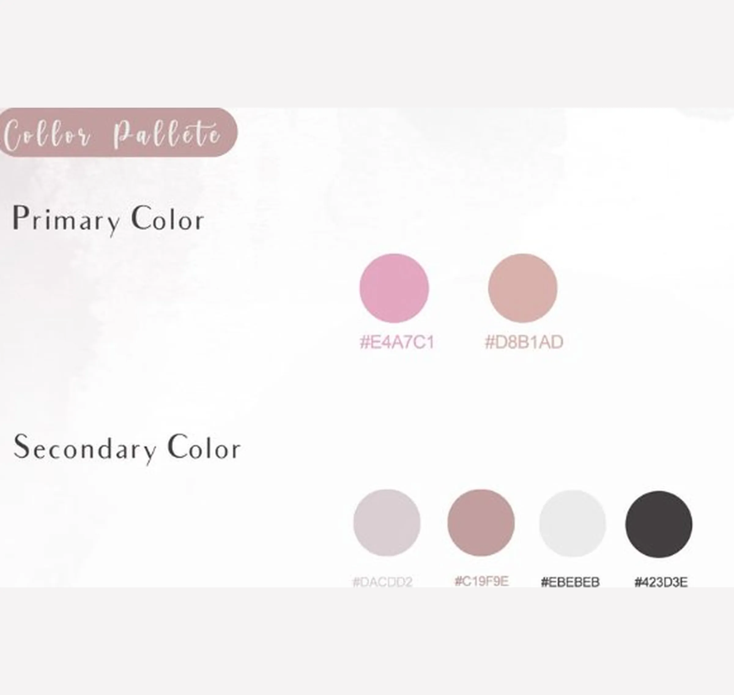
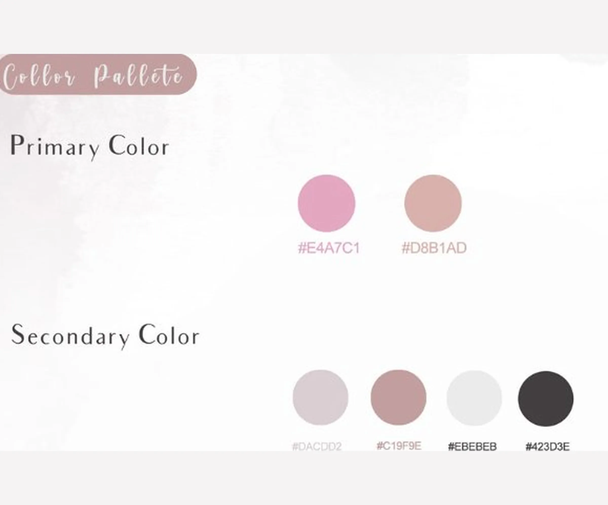
Blush and charcoal. Soft and warm, with weight underneath.
The voice
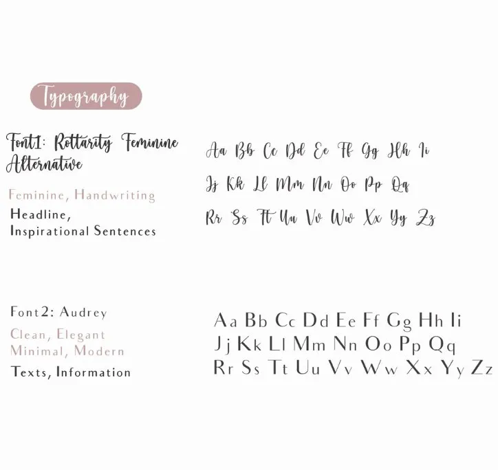
A flowing script for warmth, a clean serif for clarity.
Design notes
From idea to mark
The mark is built in layers, and each layer answers one thing. The story comes first: a lotus that grows in mud and still reaches the light. The rhombus gives that lotus a firm frame to sit in. The script monogram is drawn through the frame, so the mark carries Julia’s initials as well as the symbol. The second mark takes the same ingredients, the lotus, the initials and the botanical detail, and packs them into a rounded frame for tighter spaces.
Two marks, one family
The main mark is the lotus in a rhombus, with the script JS monogram running straight through it. The flourish of the script spills out past the frame on both sides, which keeps the mark from feeling boxed in. The second mark is the contained one: a rounded frame with JS set large, the name written underneath, small botanical sprigs on either side and a lotus at the foot. It is there for the places where the wide flourish will not fit.
Colourways
Both marks come in the same set of versions: dark on light grey, dark on blush, and fine outline versions on charcoal, in white and in blush. That covers light and dark backgrounds without redrawing anything.
Type and colour
Two typefaces share the work. Rottarity Feminine Alternative, a flowing script, is for headlines and short inspirational lines. Audrey, clean and elegant, is for text and information. Blush brings the warmth and charcoal gives it weight. The palette and typography sheets sit alongside the logo board, so the rules for using the identity are all in one place.
Palette
- #E4A7C1
- #D8B1AD
- #423D3E