OptiWell
A calm eye mark for a product about looking after your eyes.
Idea
A calm eye mark for a product about looking after your eyes.
System
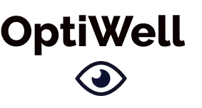
Heavy rounded wordmark with a single outline eye in deep navy.
Delivered
Brand identity and mobile app.
Design notes
The client and the brief
OptiWell is a product about looking after your eyes. The work was a brand identity and a mobile app, and this page shows the logo.
From idea to mark
The route is short, on purpose. The product is about eyes, so the symbol is an eye, drawn as simply as it can be: one outline. The name is set in heavy rounded letters so the logo has one strong element, the wordmark, and one quiet one, the eye.
The eye
A single outline eye, drawn in deep navy, sits under the wordmark. It is the only symbol in the logo, and drawing it as an outline rather than a solid shape keeps it open and calm, which suits a product about looking after your eyes.
The wordmark
Heavy, rounded letters make the name friendly and easy to read, even at a small size. The name carries the logo and the eye is the quiet detail beneath it.
Palette
- #10142A
- #000000