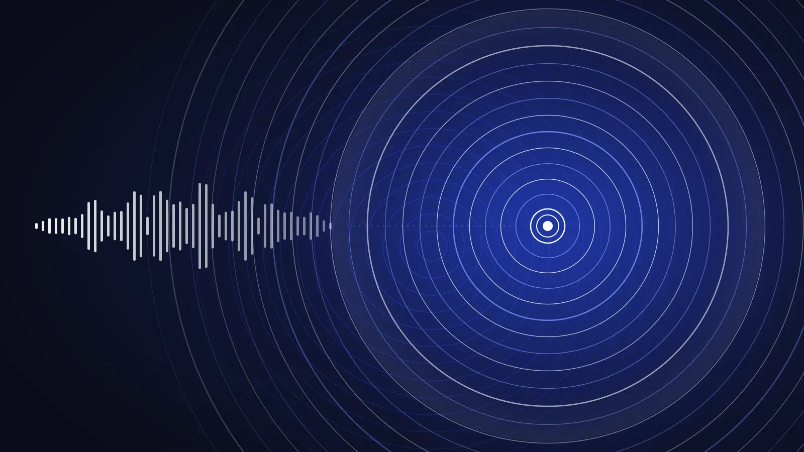
Apple Music’s new identity was made from sound. Adweek reports the concept as “made by sound”: the team played music through a transducer into a shallow bath of mineral oil and filmed the ripples in camera. An original composition by Fred again.. and NEST Acoustics works as the brand’s sonic signature. For a founder, the useful lesson is not the oil. It is that the identity came from something only that business could have made, and every surface repeats it.
Sonic branding is the practice of giving a brand a consistent sound, such as a short sonic logo, so people recognise it even when they are not looking at a screen. Below: what changed, how it was made, what we think about dropping the red, and four lessons for founders and marketing heads. The facts come from reporting by It’s Nice That, Adweek, MacRumors, 9to5Mac, The Fader and others, linked in Sources. The opinions are ours and are labelled.
Sonic branding, defined. The deliberate use of sound, such as a sonic logo, a signature melody or a set of interface sounds, to make a brand recognisable by ear. A sonic logo is the audio equivalent of a logo: a short sound that stands for the brand.
Key takeaways
- Apple Music’s new identity was built from filmed sound, with a sonic logo from the same source.
- The strongest identities come from one source only that company could make, and every surface repeats it.
- Dropping a signature colour is a luxury of scale. Newer brands usually should not.
- Showing how the identity was made builds trust.
What did Apple Music change in its identity?
Apple introduced the new identity on 21 October 2026. The wordmark had been previewed a month earlier (Design Compass, 23 September), and the app icon had already shown up in an iOS beta (Engadget). Here is what changed, as reported.
| Element | Before | Now | Reported by |
|---|---|---|---|
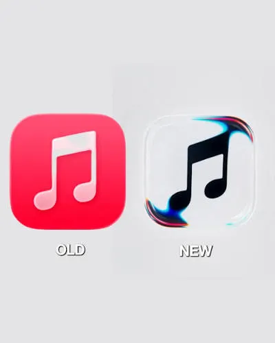
| App icon | Red icon with a beamed eighth note, in use for about 13 years | Black-and-white version of the note; white on black in dark mode | Engadget, MacRumors |
| Colour | Red as the signature | Black and white as the base, with colour appearing in the animated visuals | The Fader, MacRumors |
| Wordmark | Apple’s San Francisco system font | Lowercase, heavier and more tightly spaced; Adweek describes a custom version of Apple’s SF Pro | Design Compass, The Fader, Adweek |
| Motion | Not covered in the reporting we reviewed | Ripples of sound, captured in camera rather than rendered | 9to5Mac, It’s Nice That |
| Sound | Not covered in the reporting we reviewed | A new short audiovisual mnemonic, with an original composition from Fred again.. and NEST Acoustics | 9to5Mac, Adweek, It’s Nice That |
| Where it appears | n/a | Apple’s website first, then iOS 27.2 and macOS 27.2; Apple Music 7.0 on Android also moves to a black or white icon and a blue accent | MacRumors, 9to5Google |
Early public reaction to the black-and-white icon was mostly negative, according to Engadget. That is a reminder that a rebrand is judged by audiences long before it is judged by design critics.
The icon is the easiest change to see, so here are the old and new versions side by side.
How was the Apple Music identity made?
The agency is TBWA\Media Arts Lab, working with Optical Arts, according to It’s Nice That. The process, in plain terms:
- Music was played through a transducer, a device that turns an audio signal into physical vibration, in a shallow bath of mineral oil (Adweek).
- Custom software reduced musical notes to sine waves that drove the rig (It’s Nice That).
- The team found that playing too many notes at once made a frothy mess. So they started from a visual effect they liked and worked backwards to the notes that produced it (It’s Nice That).
- Those notes became the ingredients of the sonic logo (It’s Nice That).
- Six or seven variations of the ripple effect are each designed around a different product feature, such as AutoMix, Spatial Audio and Lossless Audio (It’s Nice That).
Apple also published a behind-the-scenes video (9to5Mac). It’s Nice That argues this kind of content now satisfies “a growing desire to know that something actually happened at all.”
What is a sonic logo, and why does it matter?
A sonic logo, also called an audio mnemonic, is a short, ownable sound that stands for a brand. It does the job a logo does for the eye, but for the ear. It matters most where screens are absent or secondary: audio ads, podcasts, voice assistants, video intros, events and product start-up sounds.
Most small brands do not need a composed sonic logo on day one. What they do need is a decision about how the brand sounds: its voice, its pace, its type of music. We cover how a logo fits inside a wider system in Logo vs brand identity, and what a full system includes in What should a brand identity package include.
What is the new Apple Music logo?
The new Apple Music logo pairs the Apple symbol with a heavier, lowercase “music” wordmark. The app icon is a black-and-white version of the beamed eighth note, replacing the red icon. The logo is animated by ripples that were filmed from real sound, so the same identity exists as a still mark, a moving image and a sound. Apple’s own Apple Music page is the place to check for the current assets.
Why did Apple Music drop its red? (Our view)
This section is our opinion. We have not seen Apple explain its reasoning, so we are reading the move, not reporting it.
Red was one of the most recognisable assets in streaming. Dropping it is a bet that the brand is now known for something stronger than a colour. That is a luxury of scale. Apple Music can change the signature colour because millions of people already know what the product is and where it lives on their phone.
A young brand is in a different position. If a business is still teaching people who it is, its colour, name and mark are doing most of the recognition work. Our rule of thumb: before you give up a signature asset, ask whether people would still find you without it. If you are not sure, keep it and build the rest of the system around it.
What can a founder take from this?
Four lessons, in our view:
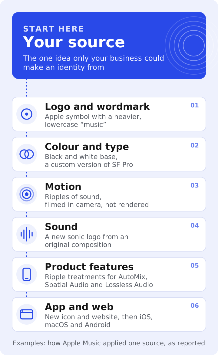
- Derive the identity from what you actually do. Apple Music’s source was sound. A bakery’s might be steam, grain or heat. A SaaS product’s might be the way data moves through it. Mood boards borrow; sources are owned.
- One source, many surfaces. The same idea ran from logo to motion to sound to product features. If every surface starts from a different idea, the brand feels like a collection, not a system.
- Edit until it is yours. The team did not use the messy chords. They chose the ones that produced the visuals they wanted. Restraint is part of the work.
- Show your workings. A short making-of film builds trust. For a smaller brand, a process post or a founder’s note can do the same job.
A quick audit you can run on your own brand
| Question | If the answer is no |
|---|---|
| Can you state the one thing only your business could make an identity from? | Start there before choosing colours or type |
| Does that idea show up in your logo, type, colour and motion? | You have a collection of assets, not a system |
| Do you know how your brand sounds in video, audio and voice? | Decide it now, even if it is only guidelines |
| Could someone recognise you without your logo? | Your recognition is carried by the mark alone |
| Can you show how the identity was made? | You are missing a trust-building story |
Worked example: finding the source for a small brand (hypothetical)
This is a hypothetical example, not a client project. Imagine a D2C chai brand that sells small-batch blends. Its first identity used a leaf icon and earthy browns, the same as dozens of competitors. Asked what only this brand could make an identity from, the founders answered: the sound and steam of a brew reaching its peak.
That becomes the source. The mark can be built from a rising steam curve. Motion can follow the way steam lifts and fades. The packaging can carry the same curve as a pattern. A three-note pour-and-pour-again sound can sit at the end of video ads. Nothing is borrowed, and each surface repeats the same idea. A system like this takes shape during brand strategy and identity design, not after it.
Should you refresh or fully rebrand?
Apple Music kept the Apple symbol and the music note and changed almost everything around them. That is closer to a deep refresh than a start from zero. A refresh usually makes sense when people already recognise and trust you but the brand looks or sounds dated. A full rebrand makes sense when the business itself has changed: new audience, new offer or new positioning. If you are weighing the two, our process page shows how we approach it, and how to compare branding agency quotes helps you judge proposals.
Frequently asked questions
What is sonic branding?
Sonic branding is the use of sound, such as a sonic logo, a signature melody or consistent interface sounds, to make a brand recognisable by ear. It sits alongside the visual identity and the brand’s voice.
What is a sonic logo?
A sonic logo, also called an audio mnemonic, is a short, ownable sound that stands for a brand, much as a logo does visually. Apple Music’s new one uses an original composition from Fred again.. and NEST Acoustics.
Did Apple Music change its logo?
Yes. Apple introduced a new identity on 21 October 2026. The wordmark is now heavier and lowercase, and the app icon moved from red to black and white. The visuals are built from filmed ripples of sound.
Why did Apple Music drop red?
Apple has not given a reason in the coverage we reviewed. Our reading, offered as opinion, is that a brand with Apple Music’s recognition can afford to move beyond a single signature colour. Smaller brands usually cannot.
Is sonic branding worth it for a small brand?
A composed sonic logo is not essential at the start. Deciding how your brand sounds in video, audio and voice is. Begin with guidelines for tone, pace and music, and add a sonic logo when audio becomes a regular channel.
How do I decide between a refresh and a rebrand?
Refresh when people already know and trust you but the brand looks or sounds dated. Rebrand when your audience, offer or positioning has changed. A short audit of what customers already recognise will usually settle it.
Next step
If you are working out what your brand’s source is, tell us what you are building. We will tell you honestly whether you need a refresh, a full brand identity or just a clearer brief.
Apple Music and the Apple logo are trademarks of Apple Inc. We are not affiliated with Apple.
About the author
Prem Anjwani writes about brand identity and brand strategy for founders and growing businesses.