Carewell
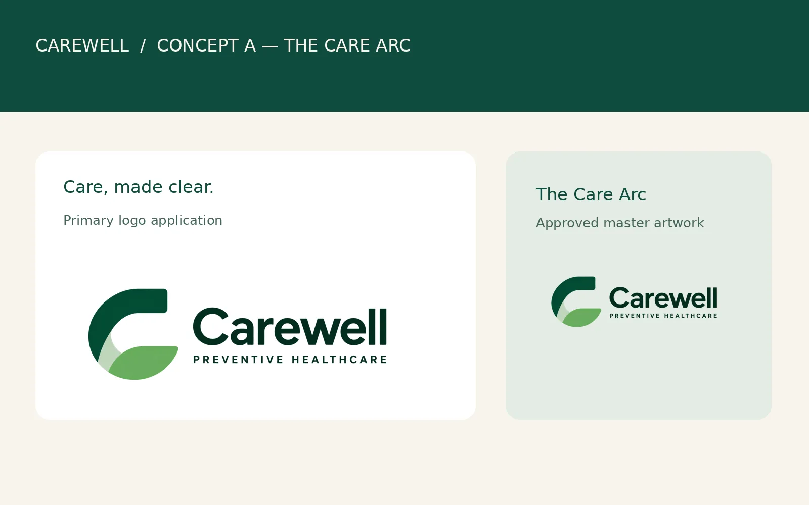
A preventive healthcare identity built on an open C and the line "Care, made clear."

Idea
Care is a continuous, supportive relationship that helps people move forward. Carewell makes preventive healthcare feel clearer, more human and easier to navigate.
System
An open C in forest green with a lighter inner sweep, set beside a bold wordmark and the descriptor “Preventive Healthcare”. Manrope for headings, Inter for body copy. Forest green and warm ivory carry the contrast, with sage for support and terracotta as a small accent.
Delivered
Brand concept, logo, colour and typography, logo usage rules and an eight-page brochure.
Design notes
The brief
Carewell is a preventive-healthcare brand for people and families who want guidance they can understand: routine care, screenings and follow-up. The promise is “Care, made clear.” Four words guide the look and the writing: trusted, human, proactive and clear. It sits with the rest of our healthcare and wellness work.

The mark
The logo starts with the brand initial. The C is left open on the right, so it welcomes rather than encloses, and it points toward a next step instead of sitting inside a clinical badge. A confident forest-green arc gives the mark stability. A lighter inner sweep moves through the lower opening and suggests progress and a supportive next step. The mark avoids a literal medical cross or heart. It is one part of a full brand identity, which also covers colour, type and the rules for using them.
The wordmark
The wordmark is bold and plain so the name reads at a glance. The spaced descriptor beneath it says what the brand does. Symbol and wordmark are balanced so neither one overpowers the other.
Colour and type
Forest green (#0F4B3E) stands for trust and steadiness. Sage (#A9C9B4) is the gentle supporting tone, and warm ivory (#F7F4EC) keeps pages calm. Terracotta (#E7A476) adds a small human warmth and stays sparing, as a highlight or callout. For health information, legibility comes before decoration: clear hierarchy, generous spacing and comfortable line lengths.
Using the logo
The rules are short. Keep the proportions and the relationship between mark and wordmark as drawn. Prefer a warm ivory or light background. On a dark green surface, place the original dark logo on a light ivory panel instead of recolouring it. Keep clear space around the logo at least equal to the height of the descriptor. No stretching, skewing, rotating, shadows or gradients. Rules like these are part of what a brand identity package should include.
The brochure
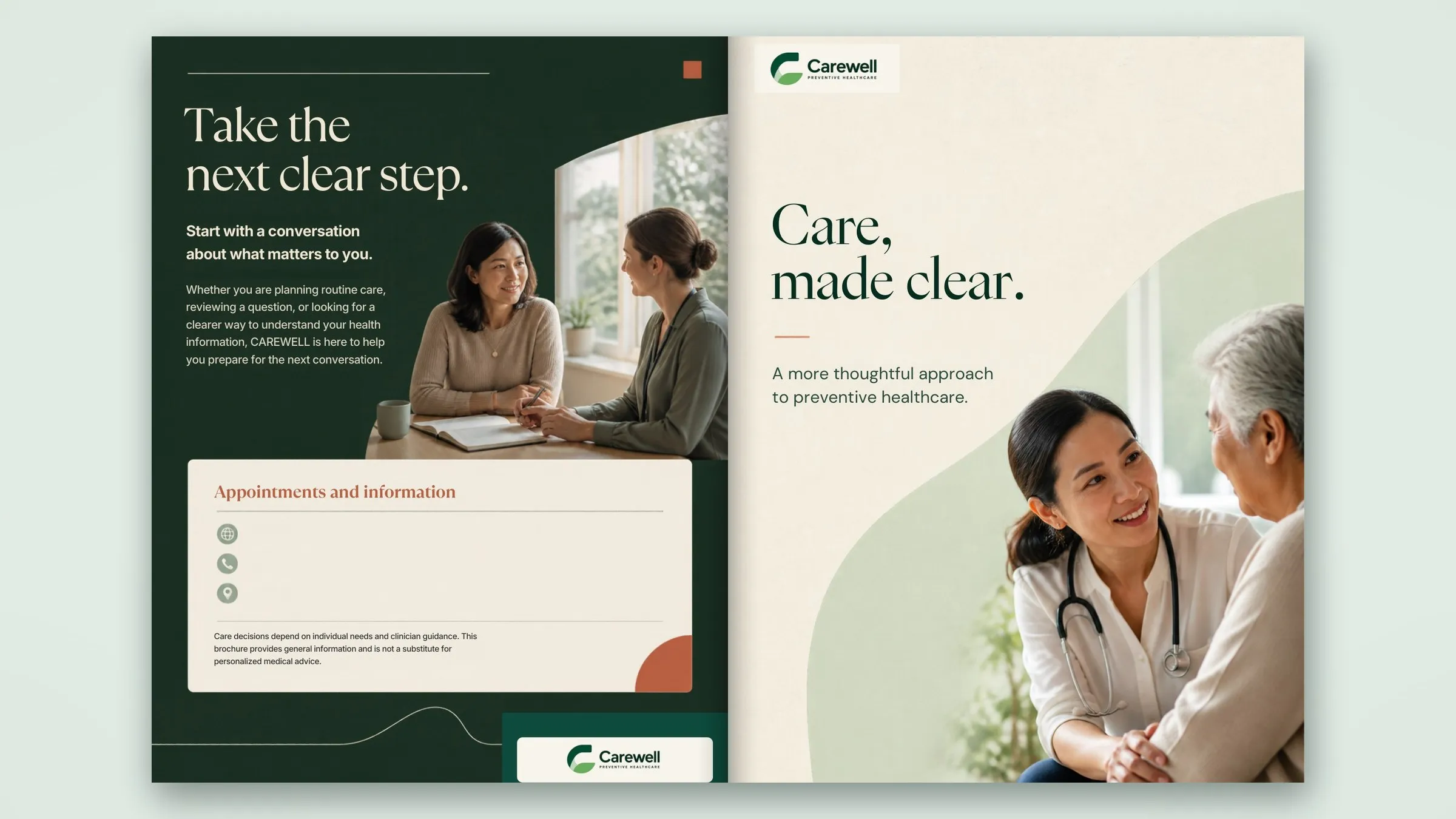
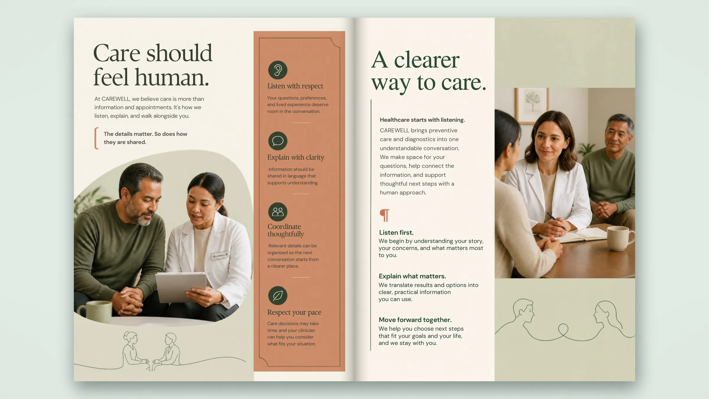
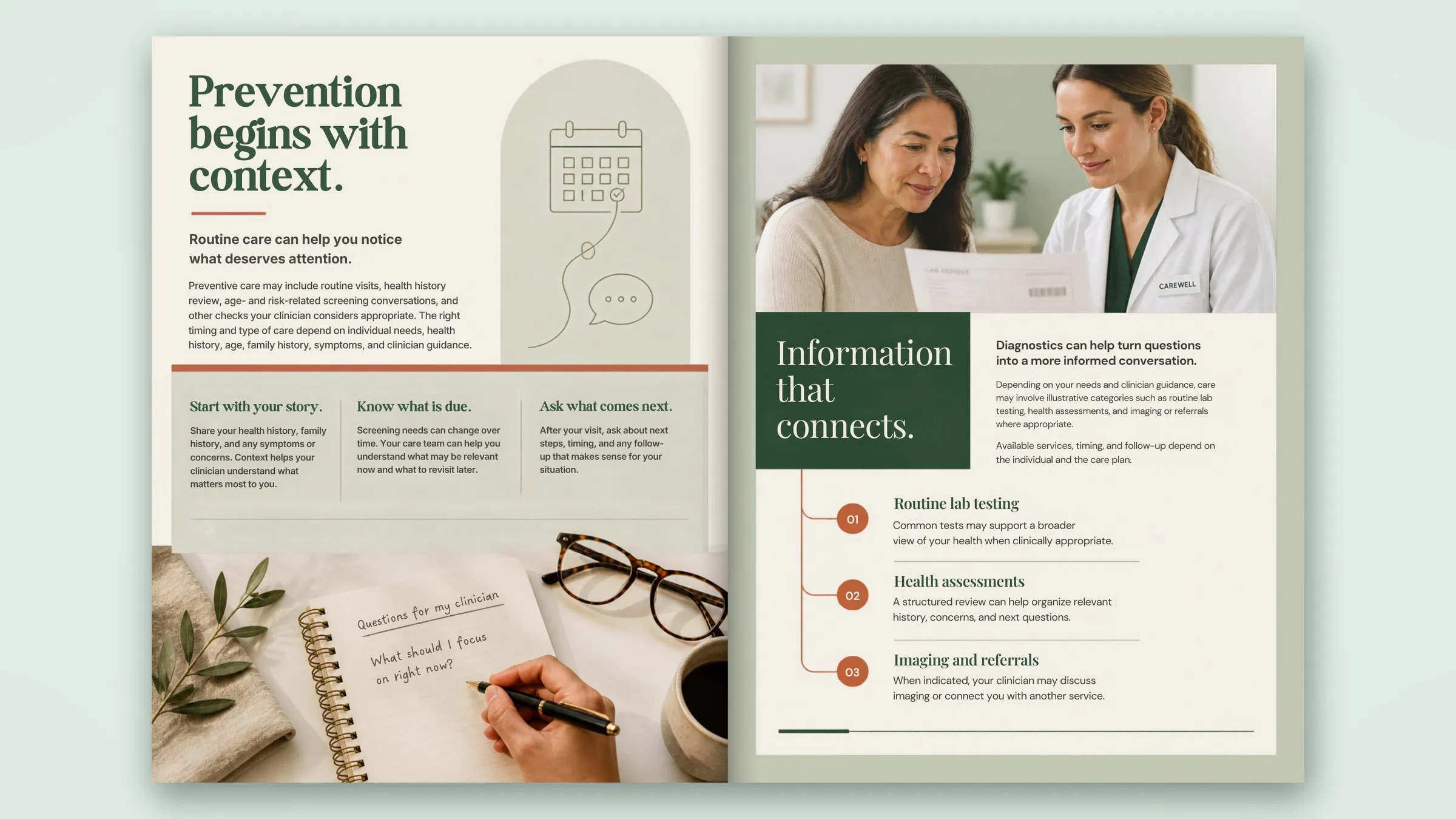
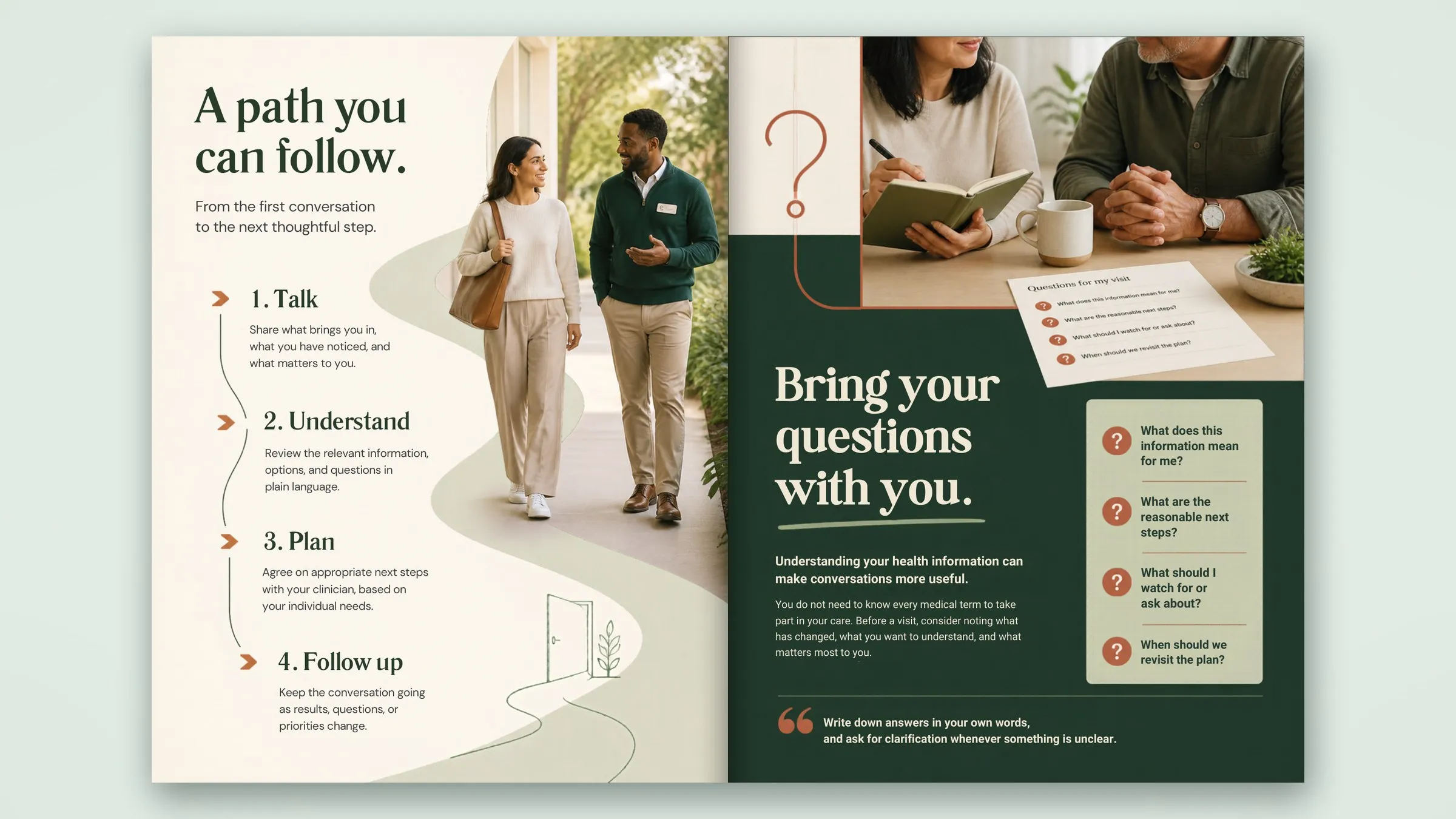
The eight-page brochure shows the identity working in print. It opens with the line “Care, made clear.” over a soft green curve, then moves through short pages that each do one job: what the brand believes, how it works, how preventive care starts, how information connects, a four-step path, questions to bring to a visit, and a closing page with a light general-information note. Ivory and sage pages carry the story, a deep green back page closes it, and terracotta is used only for small markers. Brochures like this are part of our brand collateral design.
 Enlarge image
 Enlarge image
 Enlarge image
 Enlarge image
Palette
- #0F4B3E
- #A9C9B4
- #F7F4EC
- #E7A476