Walk Dog
Finding a trusted dog walker should take a minute, not a week.
Idea
Finding a trusted dog walker should take a minute, not a week.
System
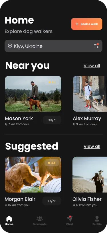
Dark interface with a warm orange accent. Book, chat, track the walk and pay in one flow.
Delivered
Logo and mobile app UI.
Design notes
The client and the brief
Walk Dog is for finding a trusted dog walker in a minute, not a week. The work was the logo and the mobile app UI.
From idea to screens
The idea is speed: a trusted walker found in a minute, not a week. That settles the shape of the app. There is one dark interface, one accent colour for the things you act on, and one flow that runs from finding a walker to paying, so there is nothing to detour into along the way.
Dark, with one accent
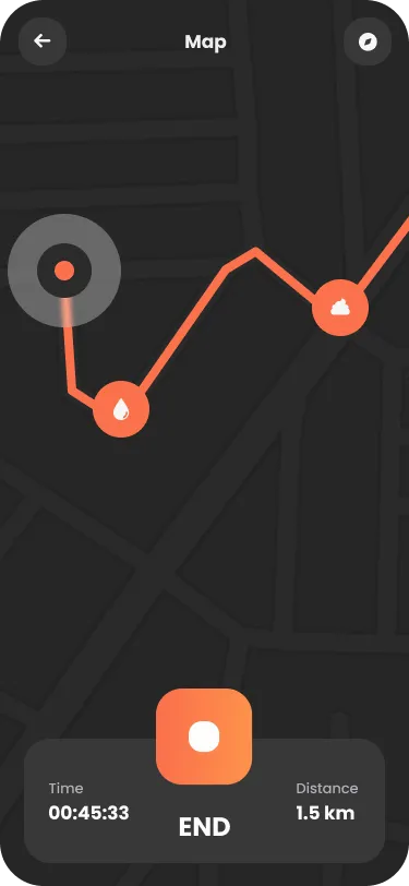
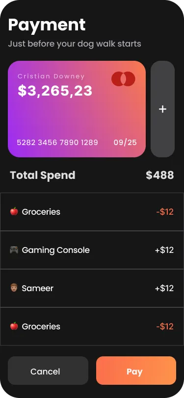
The interface is dark, with white type and a single warm orange accent. Orange is used for the things you act on, such as the main button and the route line on the map, so the next step is always easy to spot.
One flow
The three screens shown follow the walk from start to finish: Home, where you find a walker near you; Map, where you track the walk with time and distance and an End button; and Payment, where you pay. Booking, chat, tracking and payment sit in one flow rather than in separate places.
The logo
A paw-print outline sits beside WALK DOG in heavy white capitals on black. It is simple and bold, and it holds up on the dark interface.
Palette
- #FF7A50
- #1C1C1E
- #FFFFFF
FIND · TRACK · PAY